
Summer Search, the Bay Area youth development program, was seeing low sign-ups and needed to attract 150+ sophomores by the end of February. The task: enhance the website experience with minimal Dev effort. We had 3 days to develop solutions.

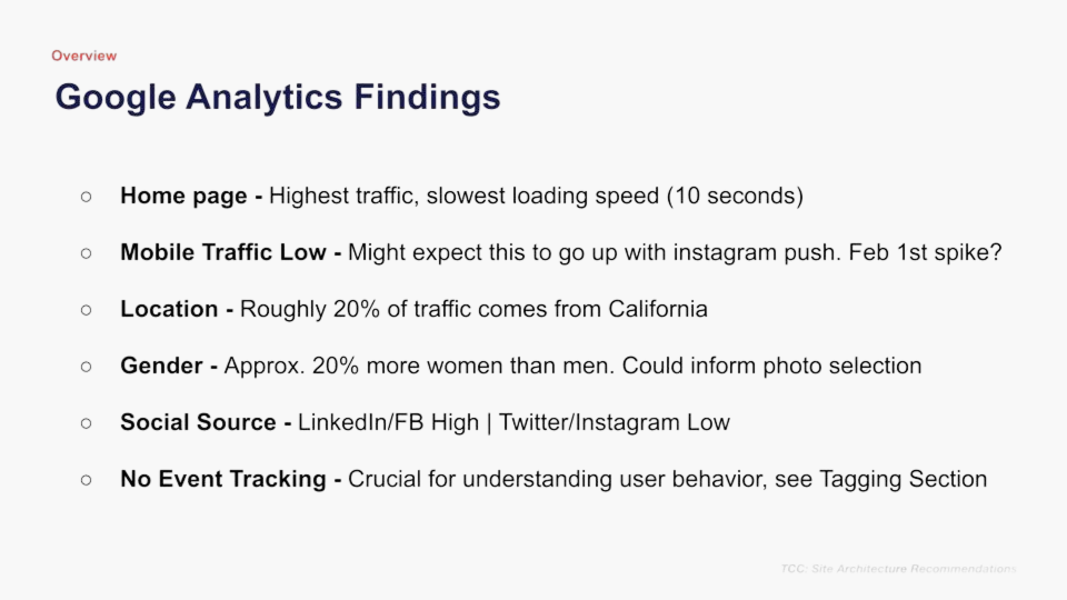
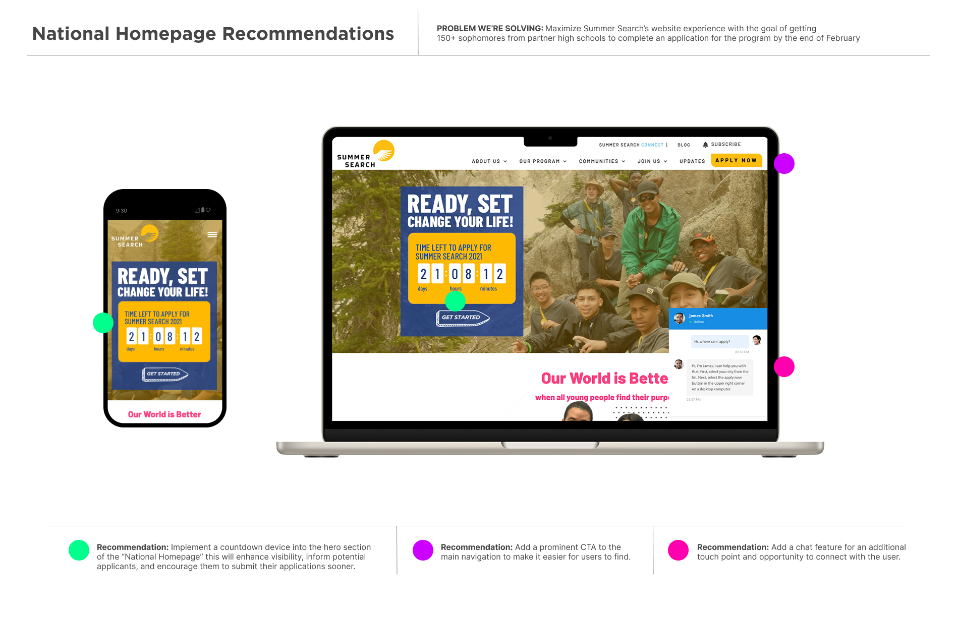
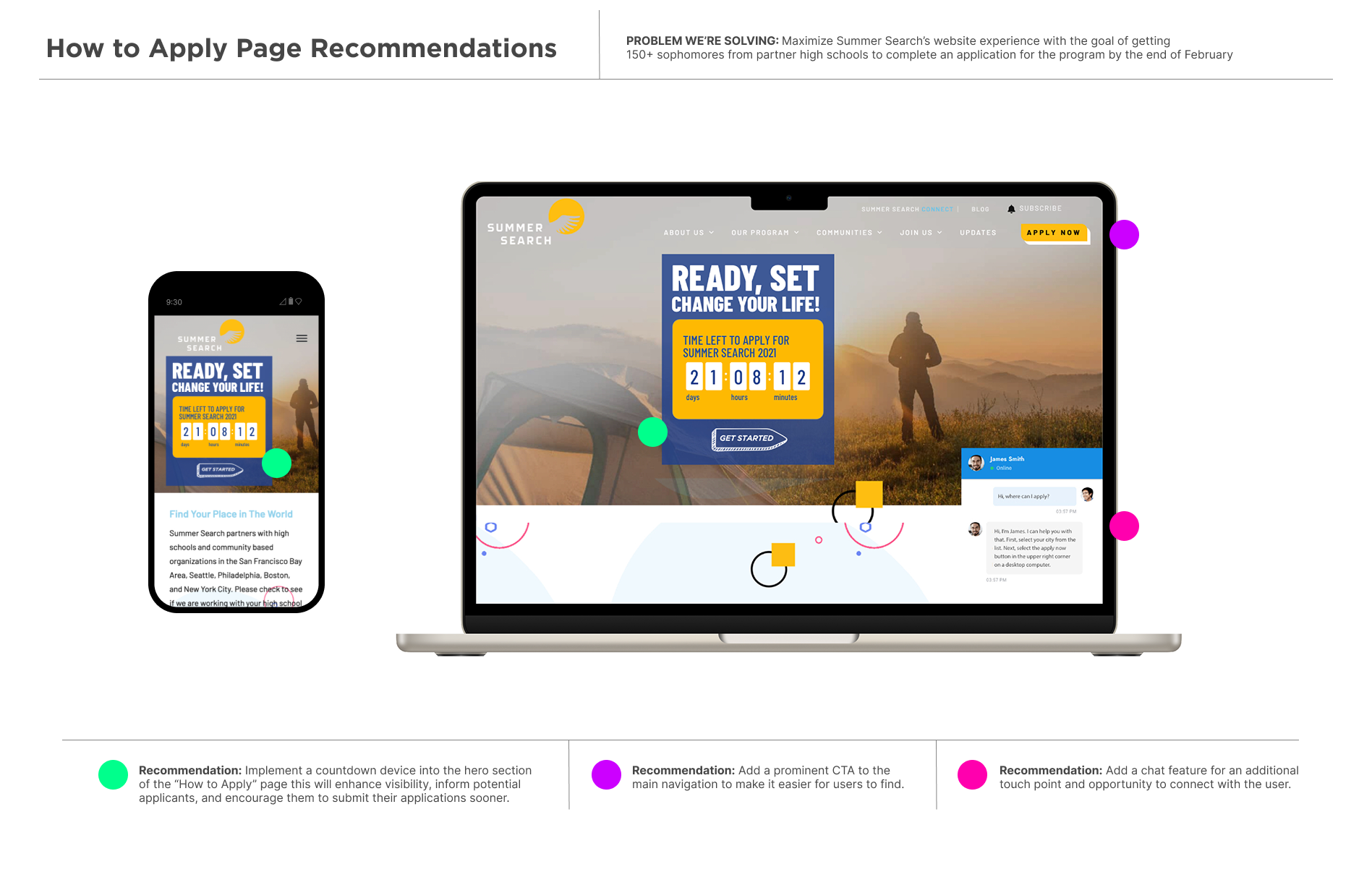
Analytics identified the pages with the highest ROI potential, and I based my recommendations on some of those insights. Engagement -focused UI elements were created and strategically placed on sections of pages that would help boost interaction.
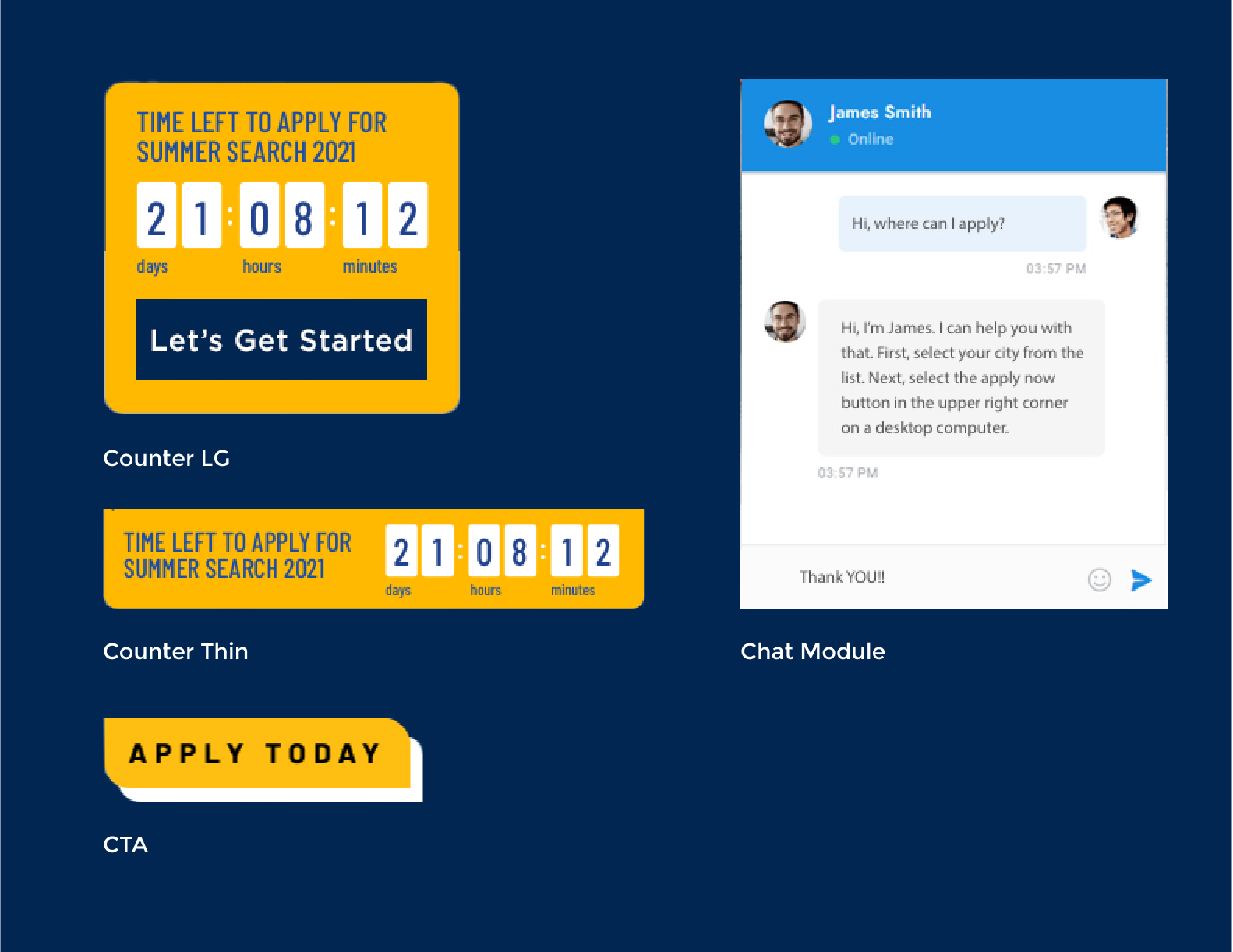
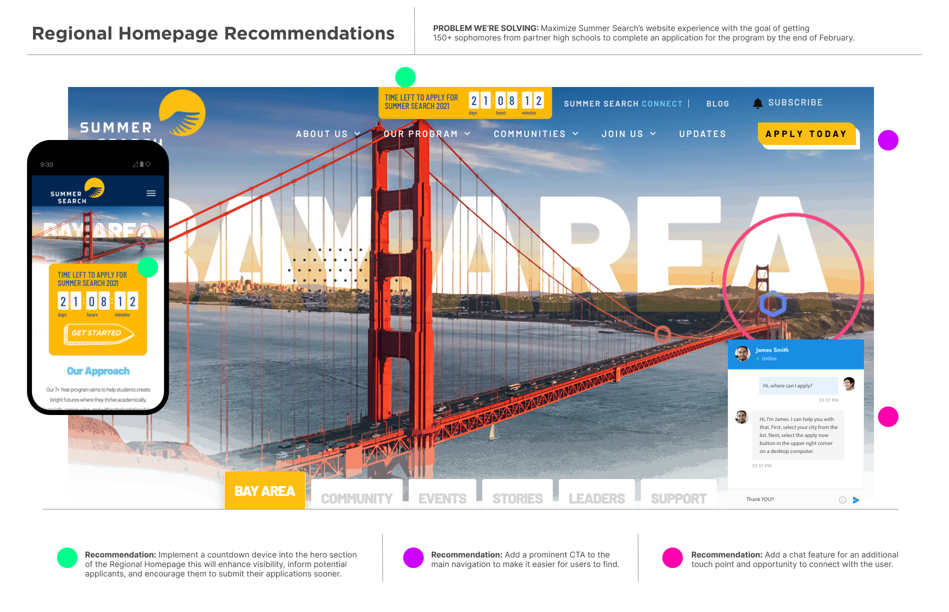
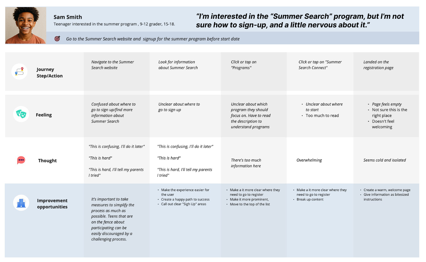
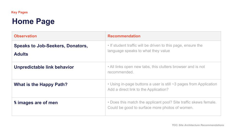
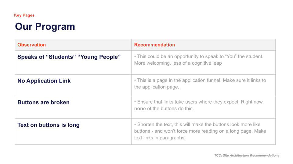
I created personas and conducted mini focus groups to discover user pain points and task-deterents. Overall, the site lacked clear ways to reach the goal of youth sign-ups. I made recommendations to increase visibility of paths to completion and make the task seem less daunting.
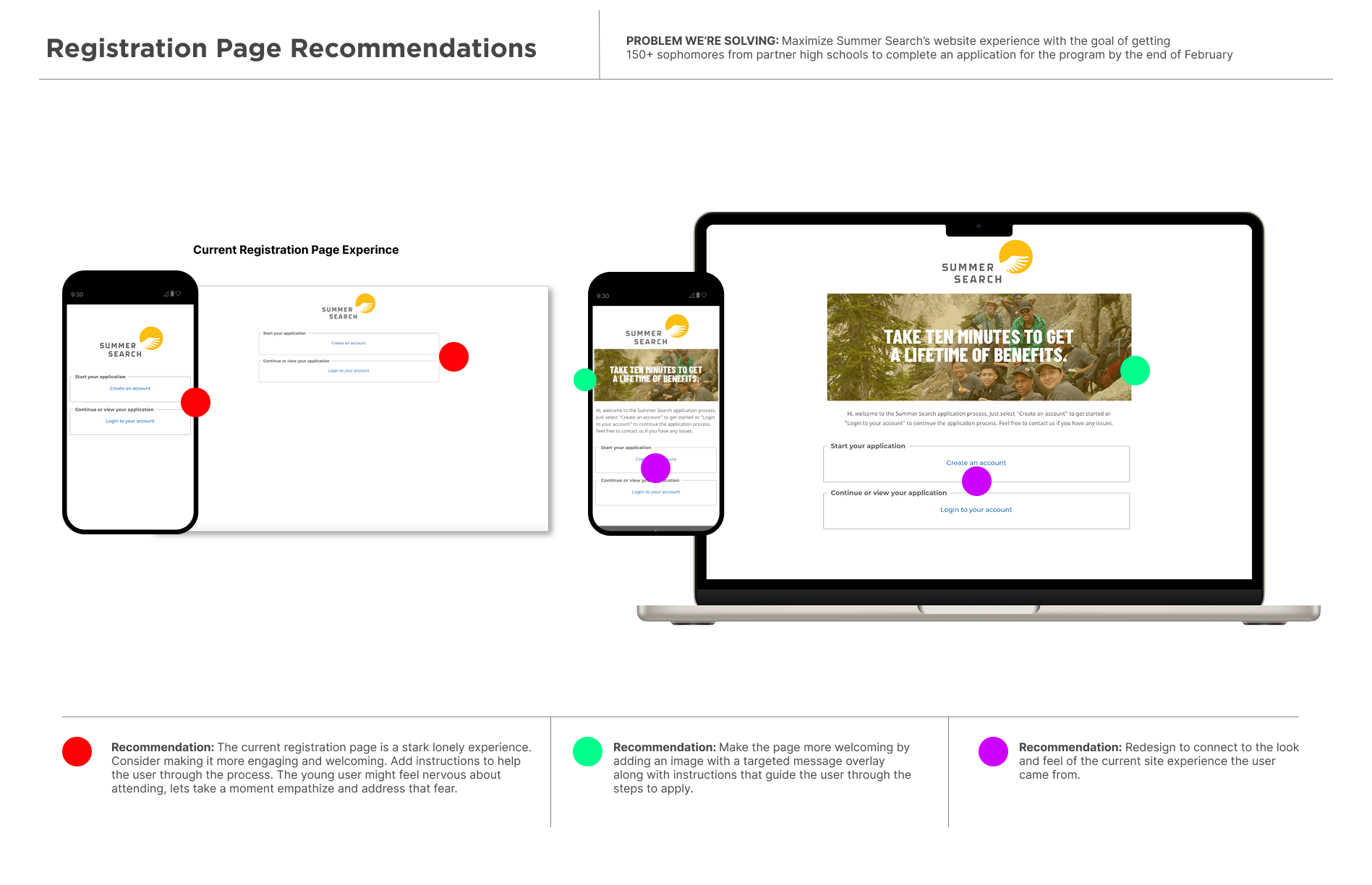
The registration page experience
The registration page lacked personality; it felt cold and uninviting. I suggested ways to make it feel warmer and more welcoming. I also recommended words of encouragement and instruction.
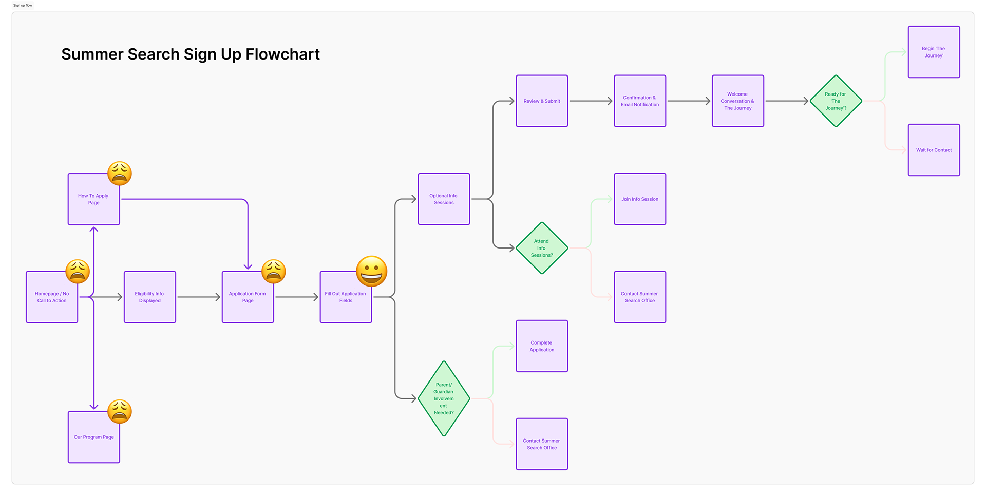
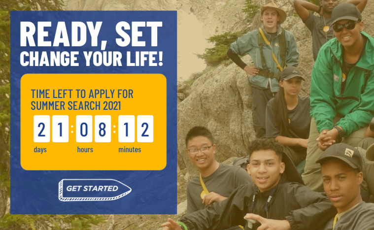
Finding the happier path🙂
Flow chart explorations helped us uncover roadblocks and pave smoother routes to simplify a sign-up process that was overly complex.