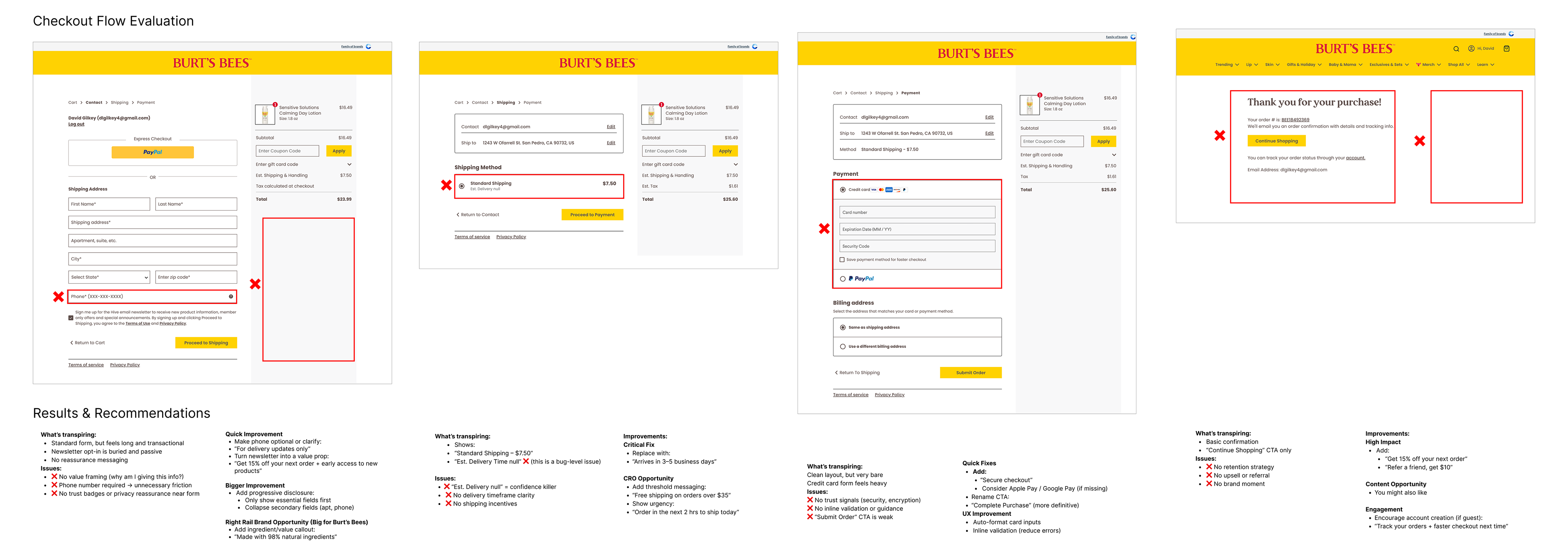
Burt’s Bees Checkout Optimization
Burt’s Bees’ checkout experience was functional but lacked key conversion-driving elements. While users were able to complete purchases, the flow missed opportunities to reduce friction, reinforce trust, and drive higher completion rates.
This project focused on identifying drop-off points and applying CRO tactics to improve funnel progression and overall conversion.
Burt's Bees Baby Landing Page
The natural beauty brand needed a webpage focused on its baby products line. An elegant solution was created that focused on the mother and baby's aesthetic. As E-comm Manager/CX, I wanted to highlight certain aspects of the experience.
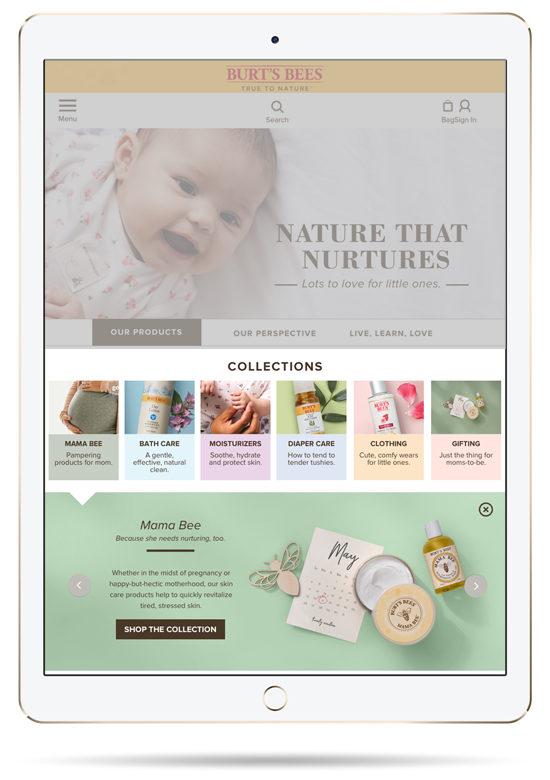
The collections section was designed to streamline product discovery while improving conversion performance. Products were organized into intuitive categories and surfaced through a dropdown interaction paired with strong visual previews. A prominent “Shop the Collection” CTA was introduced to create a clear path to purchase, increasing click-through rates and driving deeper engagement with each product line.
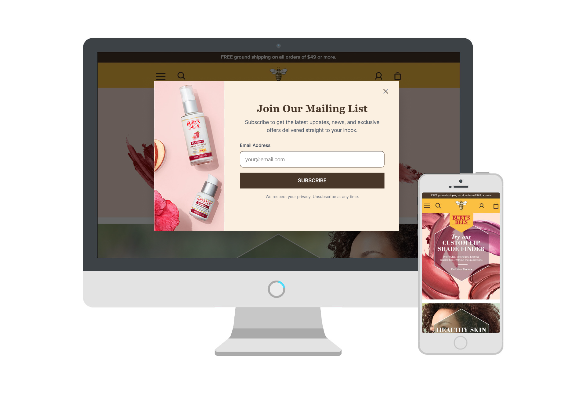
Burt's Bees Home Page
Through site analytics, we identified lower engagement on the Burt’s Bees homepage and an opportunity to strengthen funnel entry. To improve CRO, we introduced a simplified sign-up modal to drive email capture and implemented a prominent “Free Ground Shipping” bar at the top of the page.