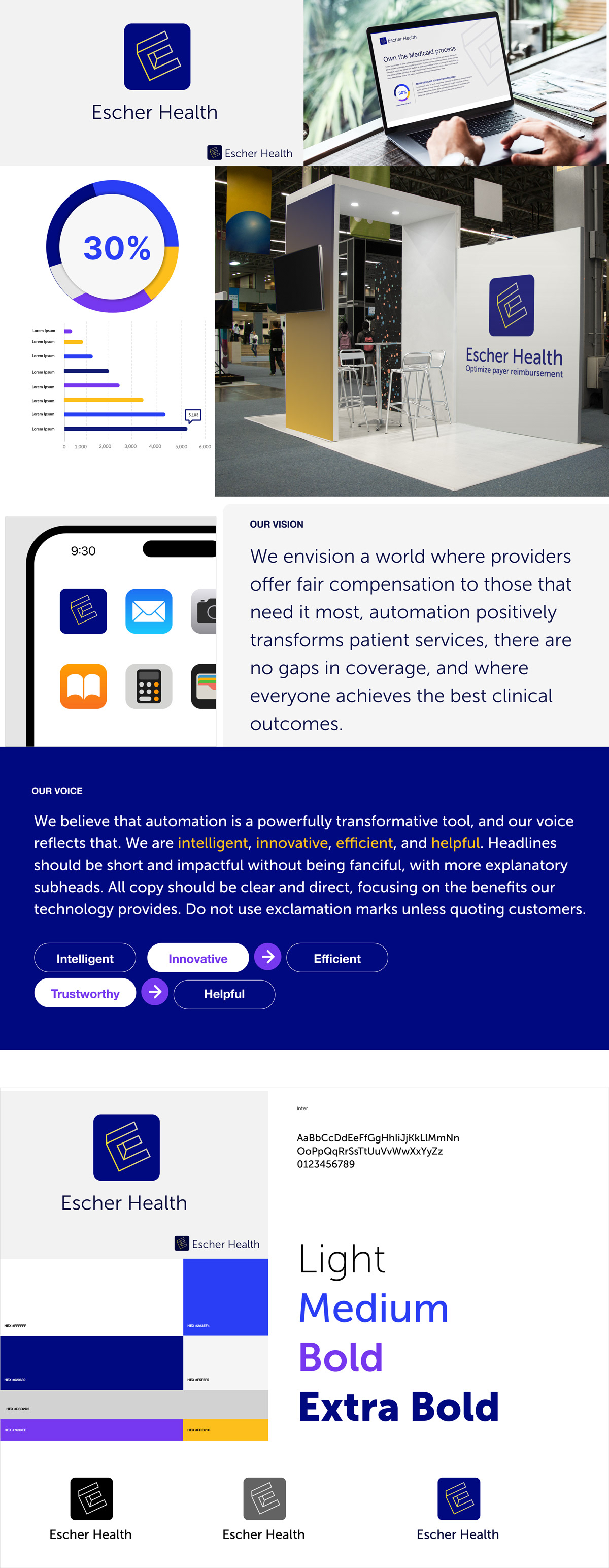
Concept 1
The client was deeply inspired by the visual artistry of Dutch artist M.C. Escher. This concept draws from Escher’s renowned work, The Impossible Trident, where an optical illusion unfolds on each side of the trident. I incorporated this idea into an "E" shape, resulting in a bold and visually striking identity. To ensure its success, I tested the design across various scenarios, evaluating its integrity in different contexts. Color palettes, font treatments, and design/voice synthesizing were also explored.
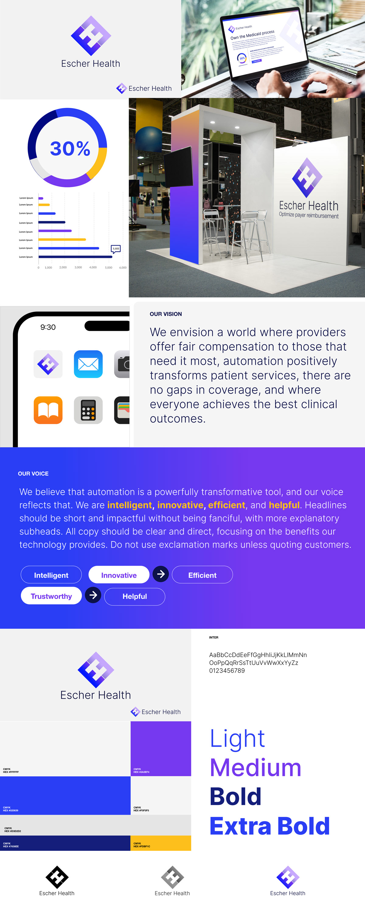
Option 2
Option 2 presents a sleek solution that incorporates visual illusions. A bold "E," angled at 45 degrees and mirrored, creates an "H" in the negative space—a clever nod to Escher Health. This approach also forms a compelling gestalt shape, with the diamond symbolizing strength and integrity. The concept has been thoroughly tested across various visual applications, including trade shows, websites, app icons, and more.